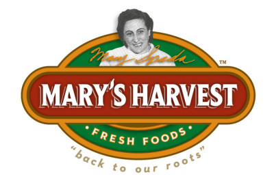
Things are Fresh for Mary’s Harvest.
Posted June 13, 2012
A completely new brand for Mary’s Harvest Fresh Foods… a new company based on a deeply rooted concept. While creating this brand, we made sure to focus on the reason behind this brand, Mary. Her pioneering spirit and focus on family, served as an inspiration for this company and the overall brand. And 70 years later, her family is going back to its roots and expanding on Mary’s vision of fresh and ready food. Read Mary’s story here. As with most of our branding projects, we spent time researching the past, their story, and how best to tell their story, all the while keeping our sights focused on the future business plans. With their Italian family background strongly a part of this experience, we choose to use this Italian flavor throughout the overall impression of the brand, from the colors to the typefaces, to the overall ‘look and feel.’ For the Mary’s Harvest Fresh Foods brand, we created everything from the logo identity, stationary design (Business Card, Letterhead, and envelope) to a full website that integrates their third party ordering system, a WordPress CMS (Content Management System) and captures the heritage look and feel they were looking for to help firmly establish the family focus of this new brand. We even had a fun produce photo shoot with some of their great fresh food offerings! Be sure to keep your eyes open very soon for some of their fresh food offerings!


