Posted August 31, 2020
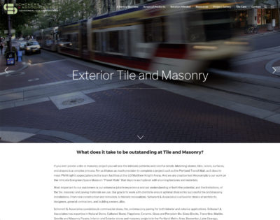
We recently helped Schonert & Associates, Inc launch a new WordPress website, after the previous one had become broken. While we were not involved in their branding, we were able to quickly help get them back up and running again with a new WordPress theme in rather short order. Pipe & Tabor loves to create…
Continue Reading >
Posted October 16, 2019
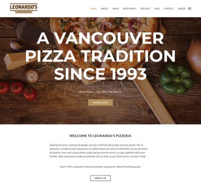
We recently helped launch a new website for Leonardo’s Pizzeria of Vancouver, WA, with all new photography and updated branding. Leonardo’s pizza is some of the best around the Clark County and SW Washington area (maybe even Portland, Oregon). That’s really saying something! Considering how great the pizza is within the Portland/SW WA area! Be…
Continue Reading >
Posted September 17, 2016
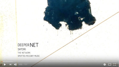
Pipe & Tabor, LLC had the joy of working with local electronic music artist DeeperNet on the music video for the first song off their new album “The Network.” The track is called “Satori,” and this provided us with the opportunity to really explore some experimental shooting ideas. We worked with shooting ink into water,…
Continue Reading >
Posted August 7, 2015
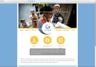
Good things come to those that wait. Last year, Pipe & Tabor of Vancouver, Washington helped Seattle Children’s Hospital out with one of their logo branding projects for their sub organization GAPPS. GCAPR helps to bring together the power of multiple organizations (March of Dimes, GAPPS, Bill and Melinda Gates Foundation, Eunice Kennedy Shriver National…
Continue Reading >
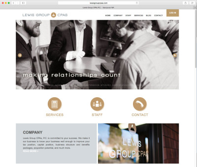
Posted February 7, 2015
We recently helped local accounting firm Amspacher-Lewis CPAs update their logo design brand to reflect their recent changes, becoming the Lewis Group CPAs. This included a recent move to 1800 F Street in Vancouver, Washington, as well as staffing changes. It’s the same great group of people, but in a more relaxed atmosphere, and with…
Continue Reading >
Posted August 28, 2014
Pipe & Tabor recently had the privilege of working on the brand identity for the new initiative within GAPPS (Global Alliance to Prevent Premature Births, which is an initiative within Seattle Children’s Hospital) called G-CAPR (Global Coalition to Advance Preterm Birth Research). The founding members are GAPPS, The March of Dimes, The Bill & Melinda Gates…
Continue Reading >
Posted July 23, 2014
One of the greatest privileges of my career, was being able to help create the institutional logo for my alma mater Whitworth University (College then) while I was working at Klundt Hosmer. Forward some 15+ years later, we were honored to work with Whitworth on their new campaign and 125th Anniversary logo to celebrate their…
Continue Reading >
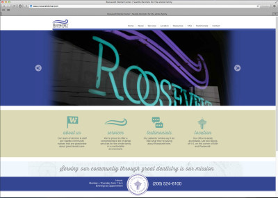
Posted July 17, 2014
Some projects take awhile to fully come together. This one has been many many years in the making. We helped brand and launch the original website for Roosevelt Dental back when phones were not ‘smart’, and Frames and Flash were still cool (neither of which were used originally). Roosevelt Dental Center of Seattle, Washington has…
Continue Reading >
Posted November 21, 2013
We’ve been wanting to work with our friends from Spirit Media for a long time now, and we finally got our long awaited chance! The design started with a thorough interview process of their clients to gain a better understanding of what makes them unique and do so well at their particular niche. Spirit Media is…
Continue Reading >
Posted June 7, 2013
Pipe & Tabor has been busy this past year, helping many of our video and business clients with custom art asset creation for print, web and motion graphics. Working with a D.C. think tank documentary on Nuclear power (with ColdWater Media and Vidano Films), creating an imaginary OS, Info Graphics, as well as other art…
Continue Reading >